- Home
- Resource Center
- Regulation Information
- ANSI
- ANSI Safety Signs
ANSI Safety Signs
Safety Sign Components

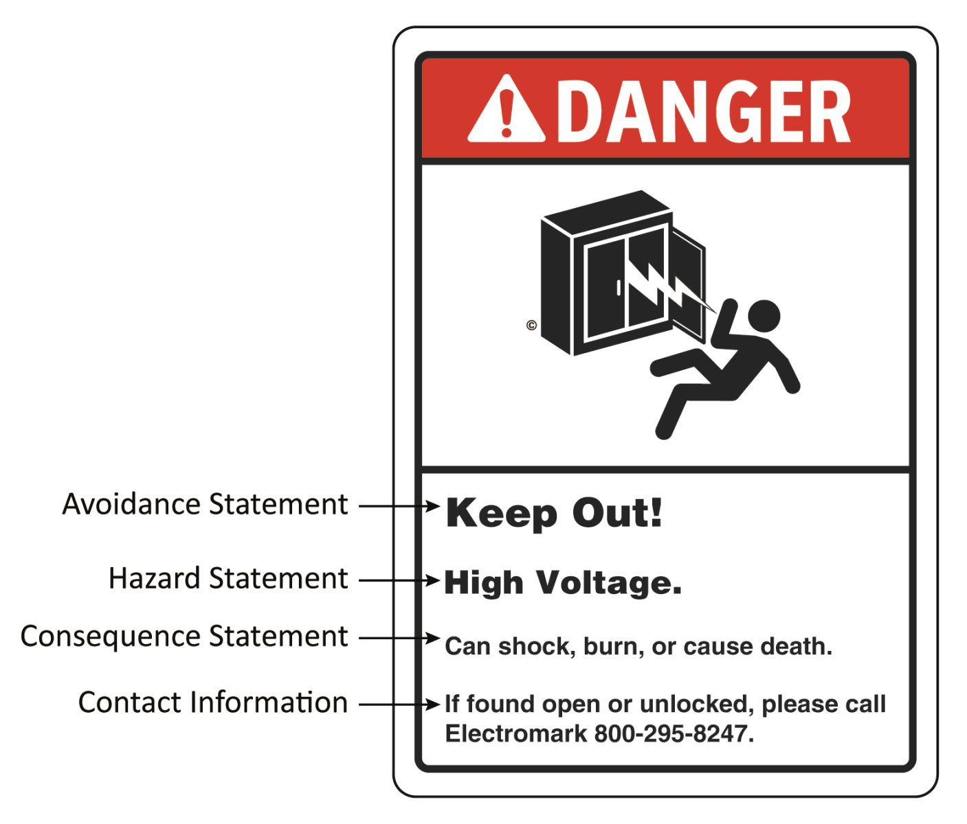
Safety Sign Types
|
Single-Hazard
|
Multi- Hazard
|
Bilingual
|
Formatting
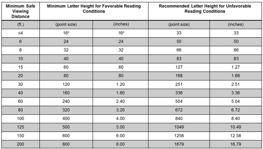
Signs should be placed in a location where viewers can read the message panel while maintaining a safe distance from the hazard. ANSI created a table that recommends appropriate text sizes based on the minimum safe viewing distance. Sans serif fonts like Arial, Franklin Gothic, Helvetica, Veranda and New Gothic are preferred when choosing fonts for a sign.
*Minimum safe viewing distance is determined by how close viewers can be to read the message and still have an appropriate amount of time to respond to the message.
Type spacing between lines or leading should be taken into consideration, messages should be easily and clearly read by viewers. Avoid spacing numbers too closely or far apart. If the message is hard to read up close it will be even harder from a far distance.
The Electromark ANSI Reference Guide is designed to be a current, authoritative source regarding the ANSI Z535-2011 Safety Sign Standard and every reasonable effort has been made to ensure the accuracy and completeness of the text, symbols, and illustrations. However, Electromark makes no guarantee, warranty, or representation that this compilation is accurate, complete, or without errors.
